Interior design trends are constantly shifting, and while some colors enjoy revivals, others fall out of favor. Designers are already signaling which shades they’re ready to leave behind as we approach 2026. If you’re planning a refresh, avoiding these six paint colors will keep your space looking current.
Butter Yellow: The ’90s Are Calling
Butter yellow, a once-popular shade, is now seen as dated. Jennifer Jones, founder of Niche Interiors, describes it as giving off “unmistakable ‘granny vibes'” and instantly aging a room. The trend is moving towards more complex yellows—muted ochres and sun-washed wheat tones—that feel grounded and refined.
Bright Red: Too Harsh for Modern Spaces
While a classic attention-grabber, bright red is falling out of favor due to its lack of depth. Ali Burgoon Nolan prefers moodier reds like burgundy and oxblood, which offer more dimension for contemporary interiors. The shift reflects a move toward richer, more sophisticated color palettes.
Plum Purple: Dominating Instead of Enhancing
Plum purple, another formerly trendy hue, is now considered overpowering by designers. Dijana Savic-Jambert notes that it tends to dominate a space rather than complement it. This trend suggests a preference for colors that integrate seamlessly rather than stand out aggressively.
Cool White: Stark and Impersonal
Cool whites are being replaced with warmer alternatives. Nolan finds these shades “stark and one-note,” particularly in spaces meant to feel cozy and inviting. Opting for chalky, off-whites instead provides a softer, more welcoming feel. The difference between an inviting white and one that feels like bleached paper is significant.
Gray: A Decade Overdue
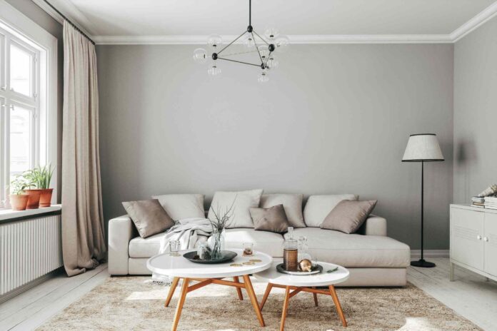
Gray, once a staple neutral, is now considered dated. Jones argues it’s time to move beyond gray altogether, either embracing true colors or warmer, lighter neutrals. This signals a broader rejection of cool-toned grays in favor of more vibrant or inviting options.
Greige: Not the Solution You Think
Many homeowners turn to greige (a mix of gray and beige) as a modern alternative, but designers are urging against it. The color is still seen as a relic of past trends. The advice is clear: skip the transition and go straight to warmer, fresher neutrals or bolder color choices.
The move away from these colors reflects a broader shift towards warmer, more complex, and inviting interiors. Designers are prioritizing depth, sophistication, and personalization over shades that feel outdated or impersonal.


